The logo & the myths behind it

One EP (credit TheMopFromMars@reddit)
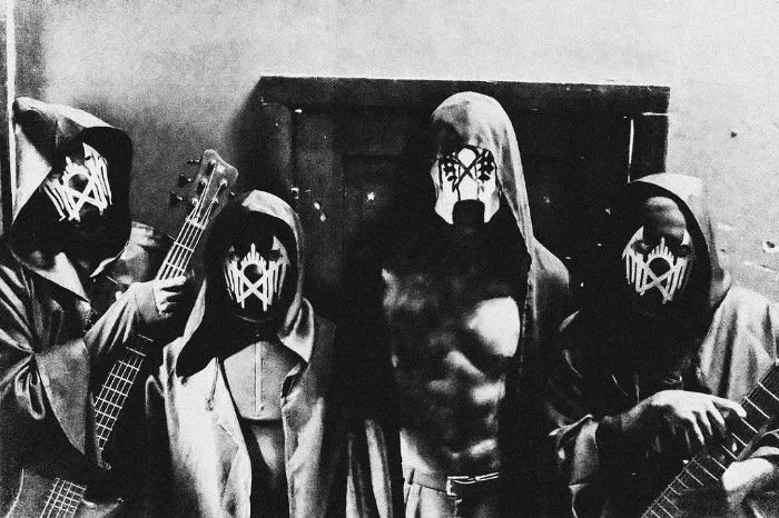
Sleep Token’s logo has remained one of the band’s greatest unsolved mysteries ever since it first appeared on the physical release of their debut EP One in 2016. With only 50 copies ever made, however, most fans likely encountered the symbol for the first time on the cover of their 2017 single Hey Ya!.
The logo later took on a new life in the music video for Calcutta, where it appeared painted in red across II’s mask.
Its geometric design has sparked endless speculation, with fans linking it to everything from alchemical symbols to ancient alphabets like runes. Yet the mystery only deepened in 2019, when the logo changed, making it even more difficult to find a theory that explains both versions.
The Runic Theory
One of the most popular theories is that the Sleep Token logo is a bind rune constructed from the Elder Futhark, the oldest runic alphabet. Each rune in this system carries both a name and a meaning, and it’s often said that reversing or mirroring a rune can invert its meaning.
In the bind rune interpretation, the logo could be built from four runes: Tiwaz, Nauthiz, Wunjo, and Uruz. Combined, they create one half of the mask design. When that half is mirrored, the full logo emerges. Interestingly, if you remove Nauthiz from the sequence, the result closely resembles the band’s earlier logo used between One and Sundowning.
Within rune lore, mirroring often suggests an inversion, implying that the right side of the logo could represent the opposite or “shadow” of the left — a symbolic play on the duality between Vessel and Sleep, a recurring motif throughout Sleep Token’s mythology.
While this theory is compelling and fits beautifully with the band’s themes, there’s one problem: this isn’t how runes historically worked. The Elder Futhark was used between the 2nd and 8th centuries AD, and the idea of bind runes carrying layered, mirrored meanings is a much later reinterpretation. For the theory to make sense, we have to leap forward over a thousand years to the 1980s New Age movement, when runes were reimagined as part of modern pagan and esoteric practices — what we now call Runic or Norse paganism.
Between AD 150–700, the Elder Futhark alphabet served a single purpose: writing. The runes were given names to make them easier to learn, and many of these names were linked to gods or everyday concepts — but their primary function was phonetic, not symbolic.
Bind runes were rarely used during this period. When they did appear, they usually combined only two or three runes, either to create a new sign for a particular sound, to save space when carving on limited surfaces, or to form a shorthand for frequently used words, such as a name — essentially a runic nickname.
The idea of “mirroring” runes simply doesn’t apply. Runes could be written facing either direction, and their meaning remained the same regardless of orientation.
As for magical use, it’s more accurate to describe it as superstition. Runes might be carved into objects for luck or protection, or inscribed on a branch and burned to ward off misfortune. But this was not systematic magical practice in the way later movements imagined it.
It wasn’t until the 1500s that bind runes and runic sigils began to be deliberately created for magical purposes. Even then, their style and form looked nothing like the modern bind rune theory often linked to the Sleep Token logo.
The Etruscan Theory
A more recent — though less common — theory suggests that the Sleep Token logo is not a bind rune at all, but rather a construction from the Etruscan alphabet. This writing system was used by the Etruscans, a civilization in what is now Italy, from around 700 BC until AD 50. By the year 100, the language had completely died out.
The Etruscan language remains only partially understood today. Much of its written record was lost due to age, or deliberately destroyed after the Roman Empire conquered Etruscan lands. What we do know is that the alphabet itself was derived from the early Greek alphabet but adapted to match the sounds of Etruscan speech.
Etruscan writing typically ran from right to left, though another style called boustrophedon was also used. In this method, the direction alternated each line: one row right-to-left, the next left-to-right, and so on. To make things even more complex, the letters themselves were mirrored each time the direction changed. In practice, this rule was often ignored, which means inscriptions can appear inconsistent and confusing.
Notably, the alphabet had no dedicated letter for the sound “O.” Instead, the letter U was used in its place.
Most ancient alphabets contain multiple variations of the same letter. This was often the result of changes that developed over time, regional differences in writing, or the fact that ancient languages sometimes distinguished sounds that modern alphabets merge into a single letter.
For example, the Etruscan alphabet had four different symbols that we would all recognize today as the letter S.
When the Etruscan letters are compared to the word SLEEP, intriguing similarities to the logo appear. The S forms the central shape, the two E’s can be rotated 90 degrees with one mirrored, the L inverted, and the P flipped — together producing the familiar symbol.
Pushing the idea further, the letters of TUKEN (with U standing in for the sound of O) can also be arranged within the logo’s structure. This makes the Etruscan theory especially compelling, as it allows both SLEEP and TOKEN to be encoded in the design.
If we go back to the very beginning, Vessel’s first mask didn’t carry the now-iconic logo. Instead, it was marked with the letters S and T in an ancient script, said to stand for Sleep Token. Later, that design was replaced with the mask featuring the geometric logo. But if the original mask spelled out the band’s name, wouldn’t it make sense for the new logo to carry the same meaning? Why would the symbolism change entirely?
Looking at it through the lens of the Etruscan theory, the connection becomes clearer. The first logo can be constructed directly from the letters S and T — with two T’s forming its structure. If Vessel’s earliest mask encoded Sleep Token through ancient letters, it’s plausible that all subsequent masks follow the same logic, only with the letters arranged in increasingly complex forms.
The Etruscan alphabet and examples of the logo
Old and new logo in Etruscan
First mask and various ancient alphabets
The Arch Theory
With the release of Sundowning, the new logo introduced a striking addition: an archway at its center, topped with five crown-like spikes. Unlike the earlier versions, this element does not connect directly to the Futhark runes or the Etruscan alphabet. Instead, its meaning seems rooted in the symbolism of the arch itself.
Arches have long represented transition, strength, and new beginnings. They mark thresholds — the passage from one state to another, from the old into the new. Across cultures, they are symbols of rebirth, renewal, and transformation, embodying the act of leaving behind the past and stepping into a new phase of existence. In spiritual and religious traditions, arches are often viewed as gateways to the divine, a bridge between the human and the heavenly.
The addition of the five crown-like spikes amplifies this meaning. Crowns are universal symbols of power, divinity, and authority, often linked to enlightenment or spiritual awakening. The number five itself carries symbolic weight across cultures: in numerology, it represents change, freedom, and growth, while in many spiritual systems it is associated with balance (such as the five elements or the human form with five points).
Taken together, the arch and five spikes may suggest that the new logo represents a gateway into transformation — a threshold that leads not only to change but also to a higher state of being, echoing the themes of rebirth and ascension that became central to Sundowning.